


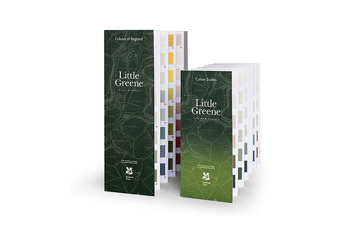
LG-NEWCOLOURCHART
Order your colour card here for Little Greene Colour of England & Colour Scales.
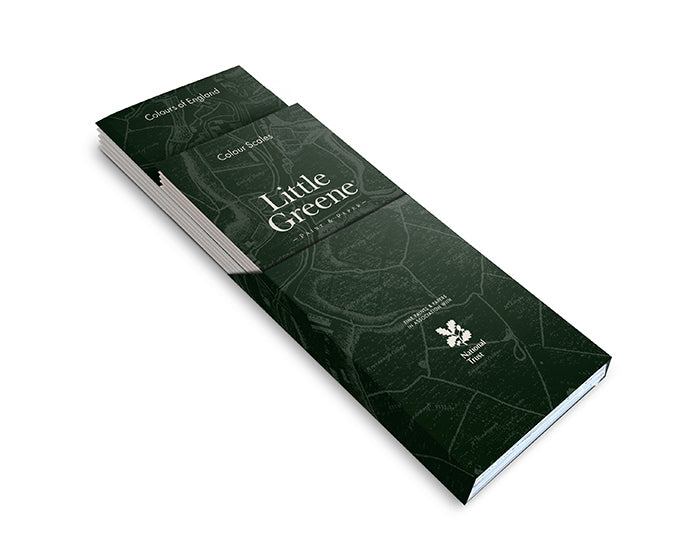
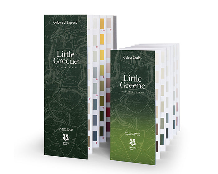
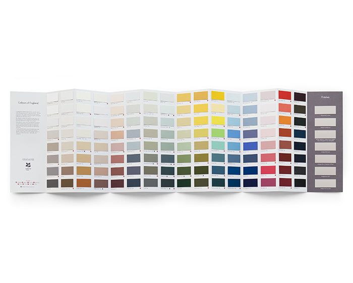
Little Greene have re-invented their ‘Colours of England’ colour chart; bringing together the best of their capsule collections and showcasing 196 Little Greene colours, all formatted in a twin pack with the refreshed and refined ‘Colours of England’ collection, alongside an expanded range of graduated shades in the new ‘Colour Scales’ section.
The Little Greene ethos has always been confident in colour and the new collections draw on over 300 years of interior design including many authentic historical shades from the 18th, 19th and 20th centuries, alongside a carefully adjusted palette of contemporary shades reflecting modern interior design and current trends in decor.
This new colour card duo has been updated to meet the growing demand for timeless, classic colours. Many of the colours in this collection have been chosen to represent the internationally renowned style of ‘English Interior Design’ including many significant shades from all over the British Isles.
Colours should be simple to choose and a joy to live with.
As well as maintaining their cherished colours, Little Greene have also introduced a number of brand new colours for this collection. Warm and joyful yellows, gentle pinks, rich and charismatic greys, beautiful, inviting blues and balanced, calming, elegant neutral-warm white.
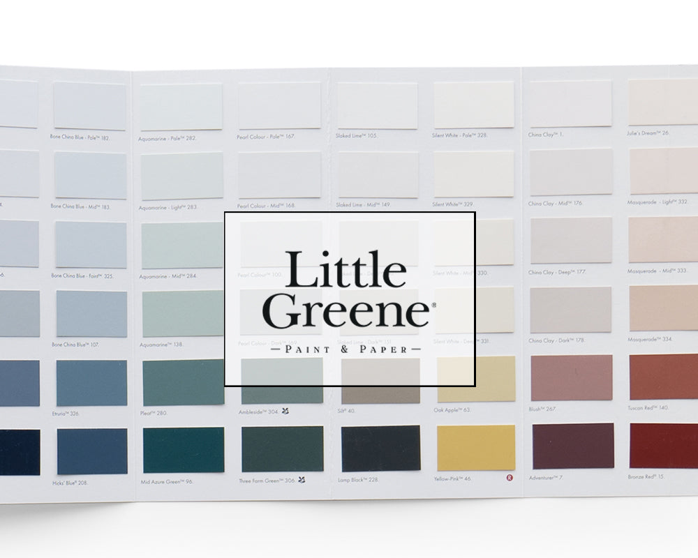
In addition, the new ‘Colour Scales’ colour card offers eight families of diluted iconic Little Greene colours, also including the popular ‘Stone’ and ‘Grey’ collections to provide a simple-to-scheme guide to colours that create harmonious backdrops to decoration, with deeper colours included to identify the undertones of each colour family.
Each colour on the card is one of a family, set out in columns according to their undertones. All columns can be used for tonal coordination, and across columns used to create a balanced contrast.
To provide an opportunity to see these colours in different environments and illustrate how they work in a coordinating and harmonious or a dynamic and diverse way, 40 of these exceptional shades are featured across both cards.
Get our designer colour charts delivered to your home so you can find your perfect colour!
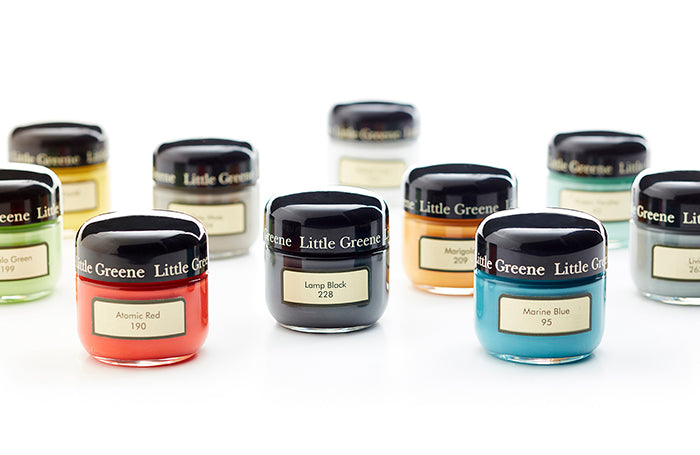
Try our paint colours at home with our handy tester pot sizes delivered directly to you!
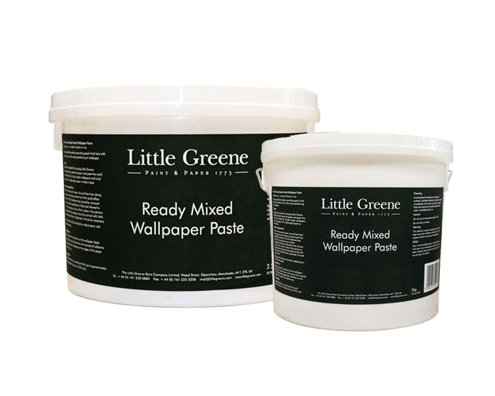
Make life a little easier and get your paste delivered straight to your door when purchasing your designer wallpaper.